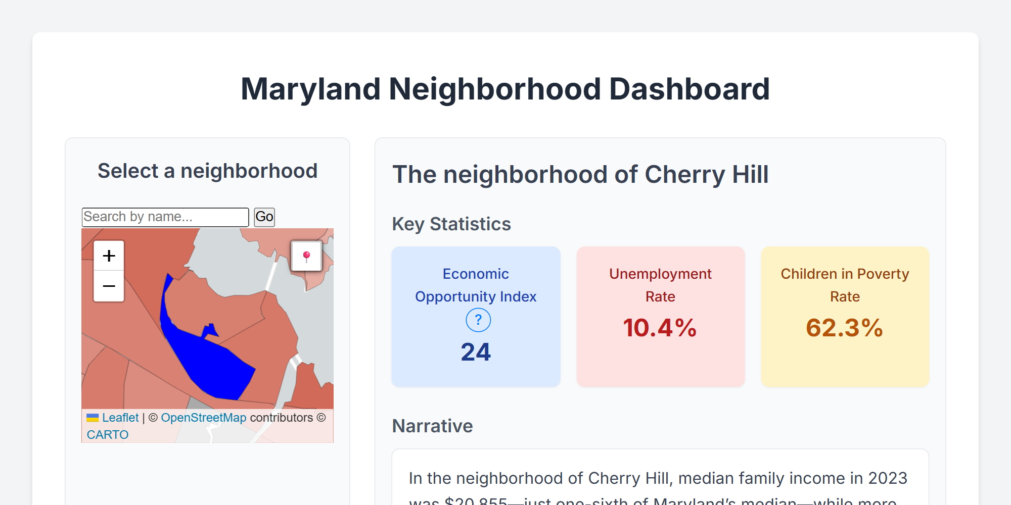
Maryland Neighborhood Dashboard
A prototype exploration of data-storytelling using GIS and AI. By combining US Census tracts with OpenStreetMap locations, we gave a meaningful place-name to each of the 1,400 neighborhoods in Maryland. Bespoke paragraphs about each location were then written by GPT 4.1, allowing the AI to choose which statistics to highlight and how to weave them together into a consistent narrative. Learn more about what impacts economic opportunity and see street-level imagery across the state.
Self-guided R Training for Maryland State Employees
The Maryland State Innovation Team is committed to building technical capacity within the State workforce to enable data-led decision making. To that end, we created a comprehensive, self-paced R training resource designed for Maryland State employees. This open-source guide covers R basics, data wrangling, visualization, geospatial analysis, and reproducible research workflows, tailored for public sector analysis.
Open-source code available here: https://github.com/Maryland-State-Innovation-Team/md-r-reference/
Access to Capital Map
Explore small business lending and financial institution access across Maryland. Created as part of the Maryland State Innovation Team's work on the Maryland Community Investment Venture (MCIV) fund, this dashboard visualizes Community Reinvestment Act (CRA) loan data, FDIC-insured bank branch locations, and NCUA credit union branches at the census tract level, helping identify gaps in access to capital for businesses and communities.

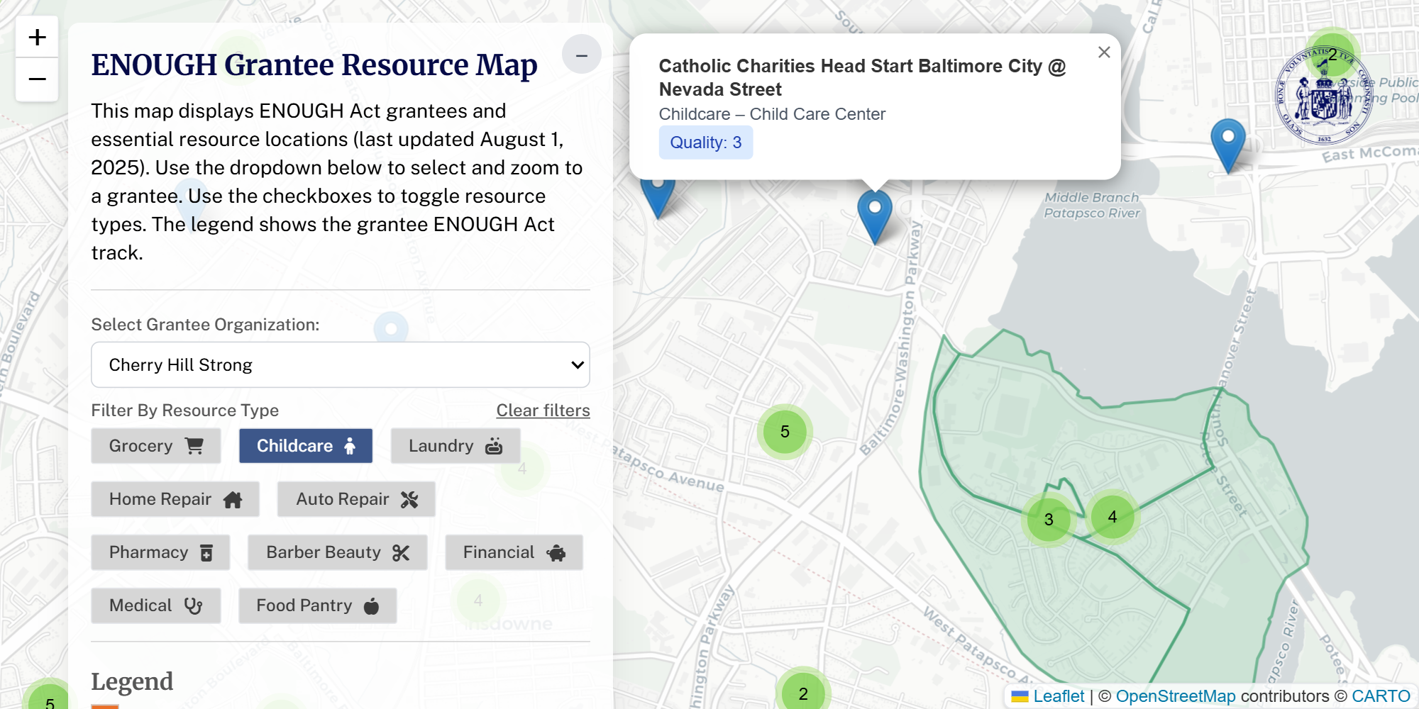
ENOUGH Grantee Business Map
An interactive map of essential resources in ENOUGH Act grantee communities, pulling together data from MDSE, FDIC, NCUA, and OSM.
Climate finance and climate vulnerability choropleth
A choropleth map I designed in October 2024 as a part of an unreleased redesign of a climate finance tracker for COP29. It shows total ODA allocated to climate adaptation on the left in green and a climate vulnerability index on the right in red. The map features formatted pop-ups on click and a slider in the middle that allows users to change the boundary. The data processing for the map as well as the creation of the HTML widget were automated using R.
Open-source code available here: https://github.com/devinit/climate-vulnerability-map-v2
IATI organization type sankey diagram
A sankey diagram showing how flows of international development assistance in 2023 reported to IATI are broken down into both donor and recipient organization types. Users can click to rearrange nodes on either side of the diagram, and hoverover either nodes or links to highlight and read the precise values in a tooltip. It shows the largest donor type is multilateral (101 USD billion) followed by government (94 USD billion), and the multilaterals are spending the most on other multilaterals first, followed by governments, followed by International NGOs. Data for the visual is scripted to download from the IATI Datastore API, so it can be kept up-to-date.
Open-source code available here: https://github.com/akmiller01/iati-type-flow-sankey
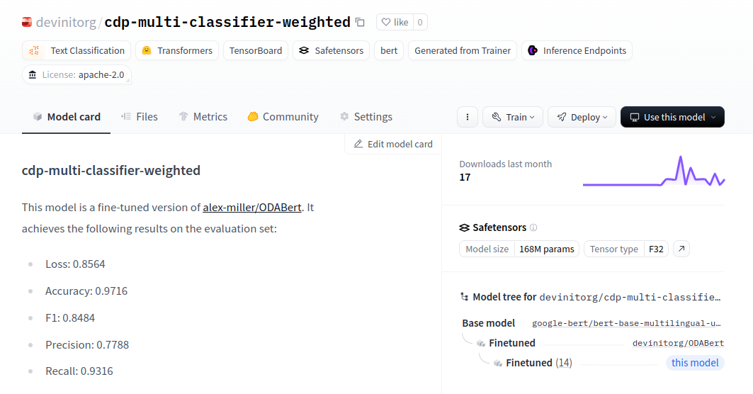
Centre for Disaster Protection BERT-based natural language processing
A multi-step machine-learning methodology for identifying rare cases of pre-arranged finance based on project text within the OECD DAC CRS. First, a base model (bert-based-multilingual-uncased) had 1% of additional development-specific vocabulary added to the model. This augmented base model was fine-tuned on the masked language-modeling task for all of the text contained within the CRS, which yielded a reduction in perplexity for development jargon by 5-fold. Next, due to the overall lack of positive samples of pre-arranged finance, synthetic training samples were created using the OpenAI API. Finally, a classification model was trained on real and synthetic samples by adding a single multilayer perceptron layer on top of the fine-tuned language model. In identifying three classes relevant to the analysis (Crisis finance, Pre-arranged Finance, and Anticipatory Action), the classification model achieved an overall accuracy rate of 97%, a recall rate of 93%, and a precision rate of 78%.
Open-source code available here: https://github.com/devinit/cdp-paf-ml-automations
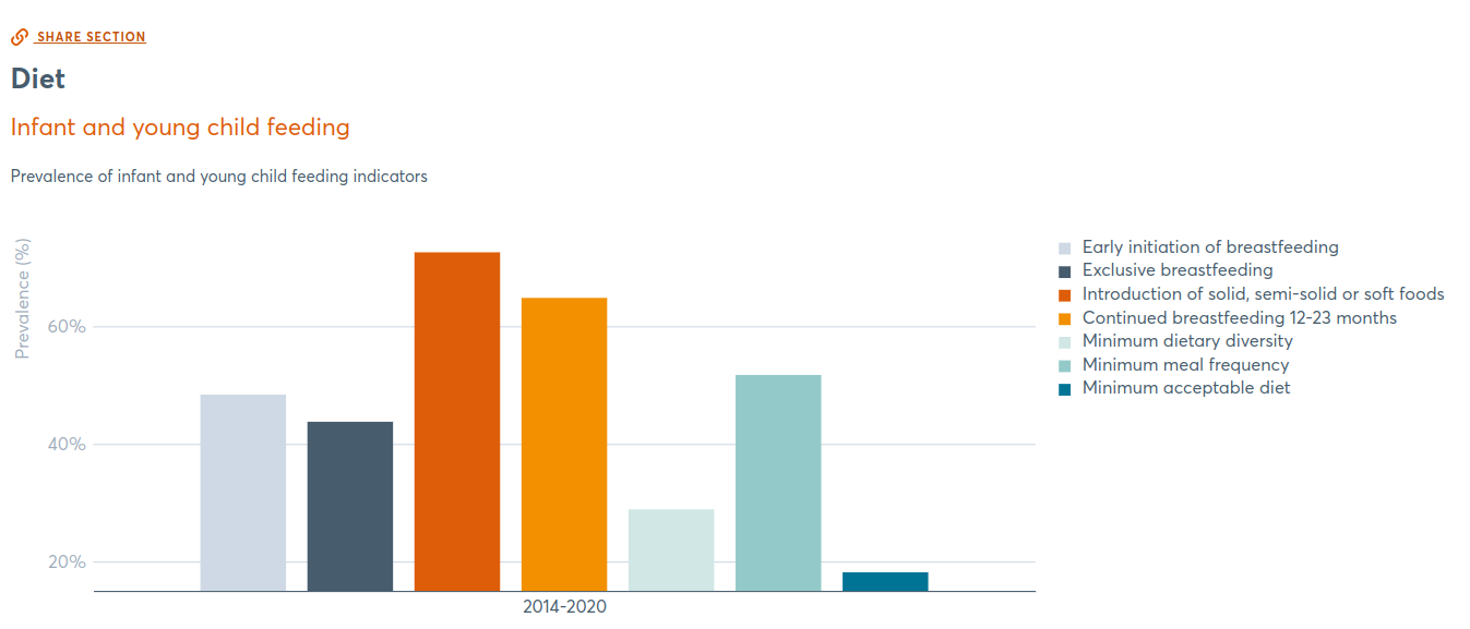
Global Nutrition Report Country Profiles
Prior to 2018, the country profiles that detailed how nations were progressing in their nutrition goals were made through a time-consuming manual process. The first step in improving this process was using ggplot in R to create production-quality charts, Jinja templates for automated narratives, and Python scripts to stitch it all together into over 200 individual profiles. In later years, the profiles evolved into country profile pages with custom D3 interactive visualizations.
Open-source code available here: https://github.com/globalnutritionreport/gnr-country-profile-2018